One percent of cases carries about half the toll — so the average stops describing the middle.
The average recorded toll is about 2,060 deaths. The middle case records 127. The average is about sixteen times the median. Both numbers are correct — and the distance between them is the whole story of this article.
The average is one of the first numbers we learn to trust, and one of the last we learn to question. In this pooled UCDP death-count distribution, a small number of very large observations pull it far away from the middle. The number is true. The interpretation is the problem.
The first ConflictLens article established a single fact and left it there: UCDP's recorded best-estimate organized-violence deaths do not spread evenly. At the case level, roughly one percent of the observations with a positive toll carry about half of the entire 1989–2025 total. This article begins where that one stopped — not with where the deaths concentrate, but with what that concentration does to the ordinary tools we reach for to describe it, starting with the average.
A country-year is one place, in one year.
Syria in 2013 is a country-year. Syria in 2017 is a different one. Every death UCDP records lands in exactly one of these boxes, and the numbers below are built by grouping and ranking them.
(ConflictLens's underlying grain is the analysis-unit-year*: usually a country, sometimes a retained historical or composite entity. Where the distinction doesn't matter, this article says* country-year for readability.)
For the 2,067 country-years with a positive toll, the average is about 2,060 recorded deaths — 2,059.94 before rounding, over best estimates rather than exact historical counts. But an average is a total divided by a count, not a portrait of the crowd. The observation at the median records 127 deaths, and the trouble starts when the first number is mistaken for the second.
What the middle actually looks like
One picture fixes the intuition before any formula does.
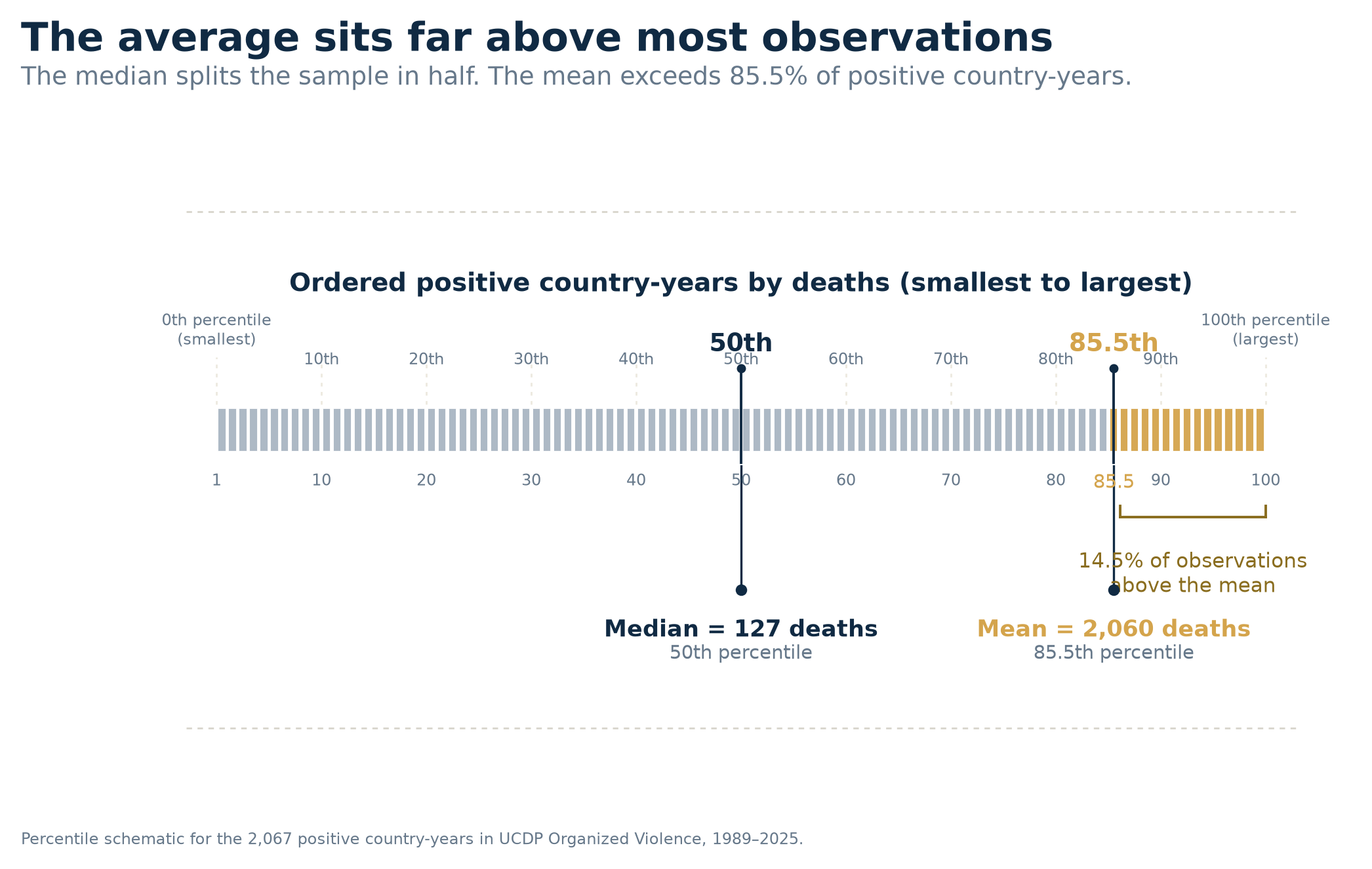
Line up all 2,067 positive country-years from the smallest toll to the largest, and walk along the row. Halfway, at the 50th percentile, stands the median: 127 recorded deaths. Keep walking. The average does not appear until the 85.5th percentile, deep in the upper reaches of the order — only 299 country-years, about one in seven, record more deaths than it does. The mean answers a real question, the total divided by the number of country-years, but that is an arithmetic result rather than a place in the middle of anything. The median gives the place, and here the two answers sit a long way apart.
The canonical bookkeeping unit is the analysis-unit-year, kept only when it has a strictly positive UCDP Organized Violence best-estimate toll, after the project's source-coverage and unit-existence rules. A separate diagnostic keeps valid zeros apart from missing values: a valid zero means an in-scope unit-year with no recorded deaths under the source-aware rule, while a null means the metric is missing, out of coverage or inapplicable, and is excluded rather than silently recoded. No pre-existence row is ever turned into a zero. That zero-inclusive view holds 7,134 valid country-years — 5,067 zeros and the same 2,067 positive observations used here — with a mean near 597 and a median of zero. It answers a different question about incidence and intensity together, and does not replace the positive-only distribution examined below.
Inside the positive universe the values run from a single recorded death to 772,463. On an ordinary ruler that range is unreadable: the smallest cases collapse into a hairline against the largest, like drawing a footpath and a mountain range at the same scale. So the figure below stretches the horizontal axis logarithmically, to hold the village and the metropolis in one frame.
How to read this chart: each row is a slice of the ranked distribution, and its bar runs from the smallest toll in that slice to the largest. The axis is logarithmic, so each labelled gridline is ten times the one before it. That also means a bar's length shows how many-fold its range widens, not how many deaths it covers — which is why the 90th-to-99th band draws the shortest bar while still spanning some 24,000 deaths. Every threshold is computed on the raw counts; only the drawing is rescaled.
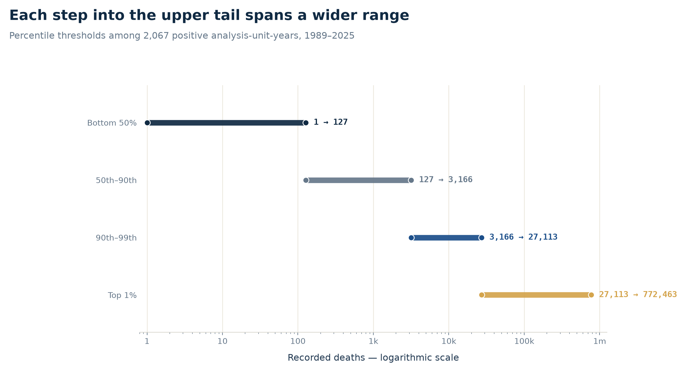
Read down the rows and the shape states itself in four steps. Half of all positive country-years fall between a single recorded death and 127. The next four-tenths reach about 3,166; the nine percent above them, about 27,113. The final one percent — 21 observations — covers everything from there up to 772,463. Each band holds fewer country-years than the one before it and spans a far wider range of tolls: 126 deaths across the bottom half, more than 745,000 across the top one percent. That widening is exactly what lifts the mean above the large majority of the data beneath it — the arithmetic is sound, but calling 2,060 a typical observation confuses an arithmetic result with the middle of the ranked distribution.
One percent bends the whole summary
The distance between mean and median is not a trick of presentation. It follows directly from how the total is built.
Rank the positive country-years from largest to smallest and start adding from the top. The largest 21 of them — about one percent of the 2,067 — account for 49.8% of all recorded organized-violence deaths in the sample. It takes just 22 observations to cross half of the entire toll, and 184 to cross 80%; the remaining 1,883 country-years, nine in ten of them, divide the last fifth among themselves. The next curve draws that same story as a shape.
How to read this chart: country-years are lined up from smallest to largest along the bottom, and the line tracks the running share of deaths. If every case carried an equal slice, the line would follow the straight diagonal. The further it sags below that diagonal, the more of the total is packed into the few largest cases at the right. The amber markers show where the top 5% and top 10% land.
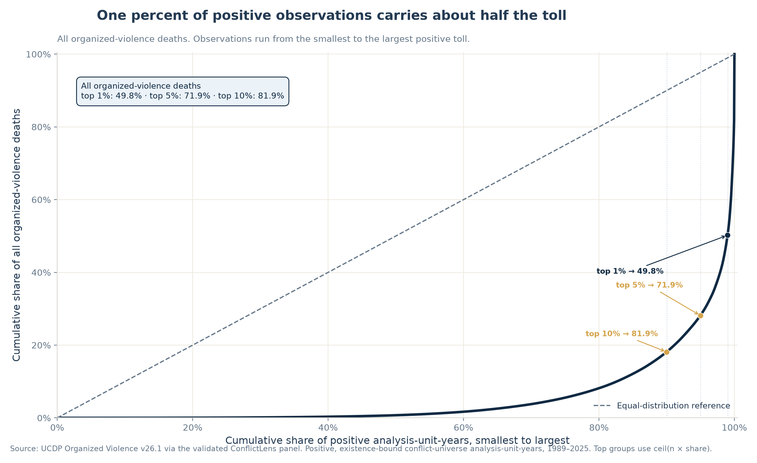
This is the machinery behind the average. Every observation counts once in the denominator, but the largest ones pour into the numerator, so a small shift at the very top moves the mean far more than it moves the central ranked observation. The "top one percent" here is 21 real country-years with very large tolls — not glitches or figures to be tidied away. Their size is precisely why they matter to the sum, and why no single summary number can carry the whole description.
Set aside the largest observations — temporarily
One honest way to test how heavily a result leans on its extremes is to set them aside and compute it again. This is a sensitivity check, not a cleaning operation: in this dataset the extremes are part of the phenomenon being measured, not mistakes. The exercise asks a narrower question — when the far end is set aside, how much does the summary move?
Begin with the full positive sample: mean about 2,060, median 127. Lift off the heaviest one percent, and the mean drops to about 1,045, nearly halved, while the median inches only from 127 to 123. Half of the original toll has just been carried out of the room, and the middle of the distribution scarcely notices it leave. Set aside the top five percent instead, and the mean falls to about 610 while the median settles at 100 — the 95% of observations that remain hold only 28.1% of the original total between them.
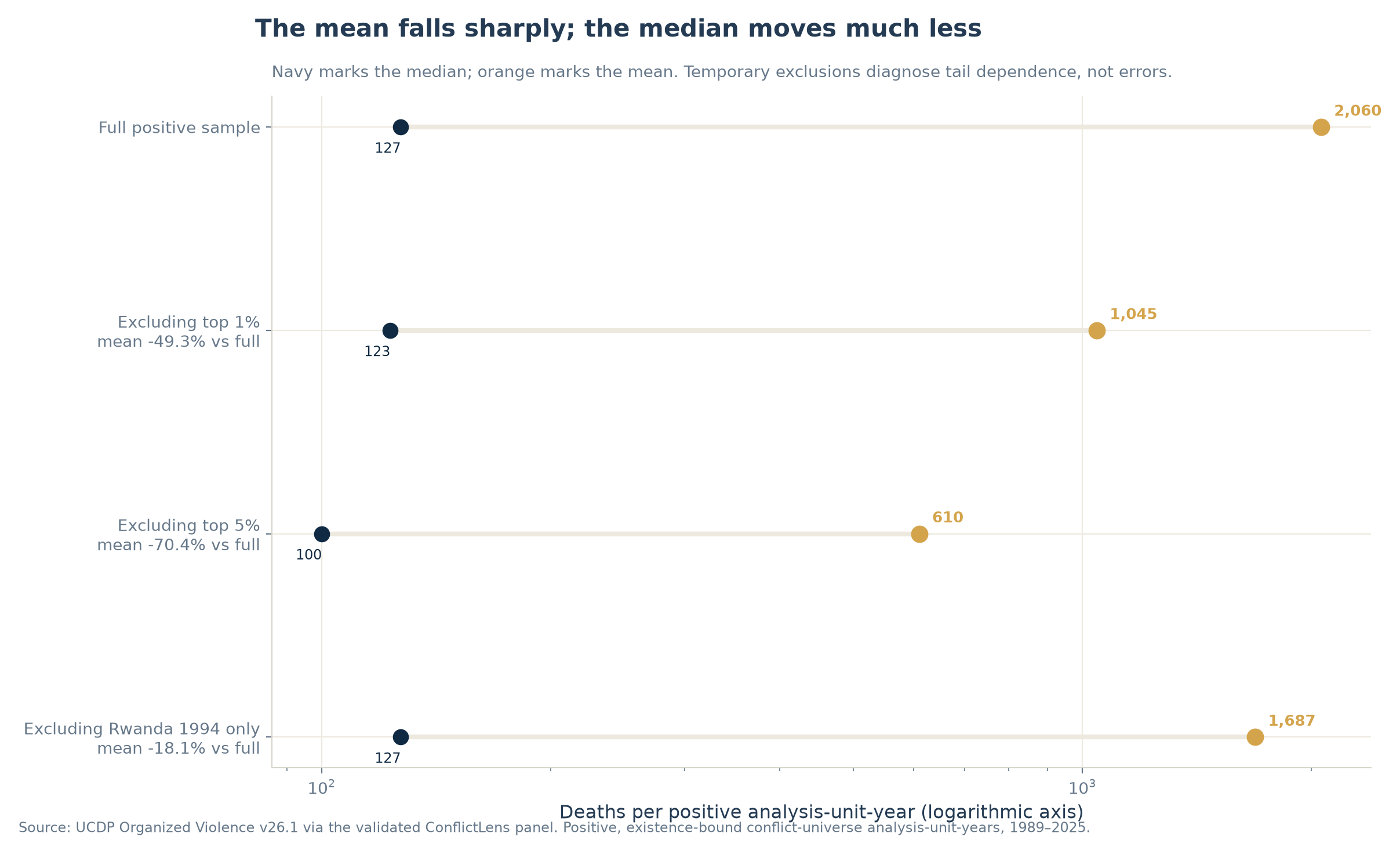
Two things survive this test, and they pull in opposite directions. The mean is exposed as highly dependent on a handful of observations — expected, since it is a total in disguise. But the lopsidedness does not leave with the largest cases: even after the top one percent is removed, the mean is still 8.5 times the median; after the top five percent, still 6.1 times. The tail gets shorter; the distribution stays far from balanced.
Rwanda 1994 offers the sharpest version of the test. It is the single largest country-year in the panel, with 772,463 deaths recorded under that analytical unit and year. Remove that one row and nothing else, and the mean still slides from about 2,060 to 1,687 — an 18% move from a single observation among more than two thousand — while the median does not budge from 127. One year weighs enormously on the average. It is not, by itself, the whole shape.
Concentration is not only a 1994 story
A single year looms large enough that it is fair to wonder whether the whole pattern is really that year in disguise. To find out, the analysis recomputes concentration separately inside four windows: 1989–1999, 2000–2009, 2010–2019 and 2020–2025.
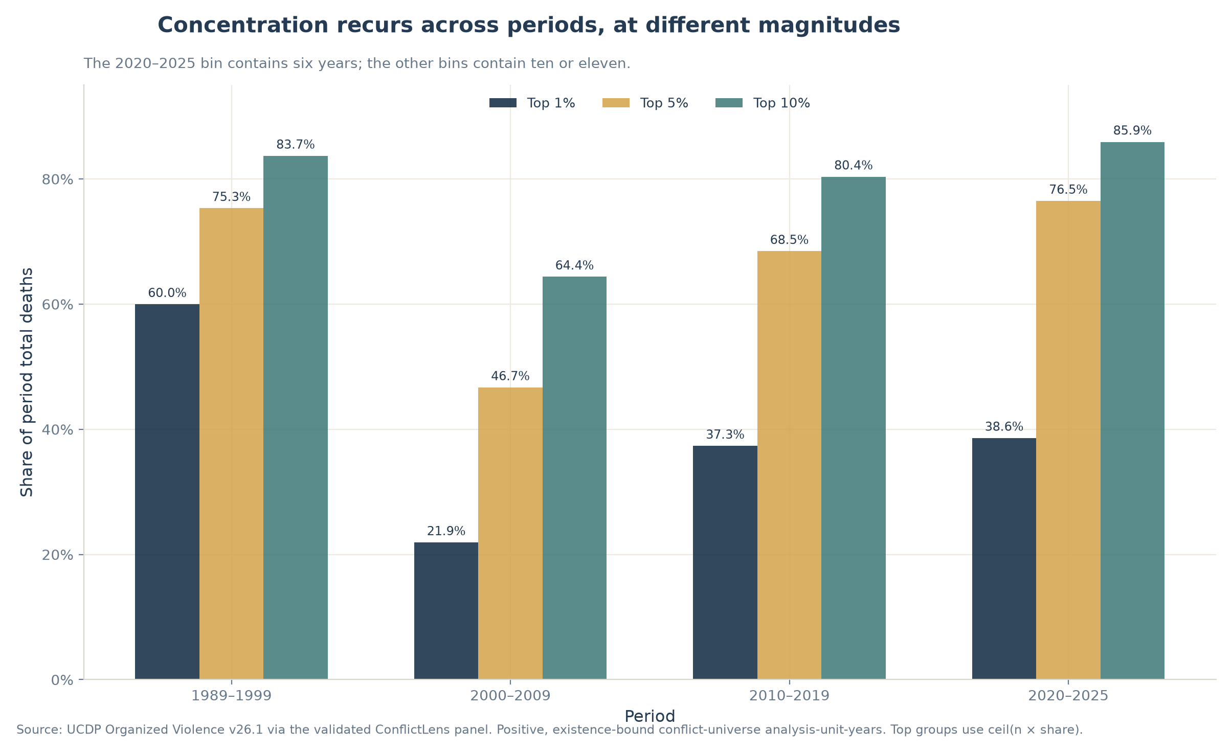
The intensity varies. In 1989–1999 the top 10% of positive country-years carry 83.7% of the period's toll, with Rwanda 1994 dominating the result. In 2000–2009 the same share falls — but only to 64.4%. It climbs again to 80.4% in 2010–2019 and 85.9% in 2020–2025. Even in the least concentrated window, it takes just 5.9% of that period's positive observations to reach half of its deaths.
The shape keeps reappearing. Without Rwanda 1994, the full-sample top 10% still carry 77.9% of recorded deaths, and 40 observations are enough to reach half; within 1989–1999 alone, removing Rwanda lowers the top-10% share from 83.7% to 68.9% without removing the concentration. The result is also stable to reasonable changes in the cut points: across every rolling ten-year window, the top 10% carry at least 62.1% of deaths and the Gini coefficient stays at or above 0.775.
This supports a narrow conclusion: concentration recurs across the observed periods. It does not establish a constant parameter, a trend, a common cause or a forecast. The windows differ in length and composition, so the bars describe recurrence, not a trend line.
A convention holds wherever a specific country-year is named here, without exception. A country-year is an arithmetic bucket: deaths grouped under a coded analytical unit and a year, marking where a number enters the sum. It is not an attribution of responsibility, an identification of victims, a claim about who was targeted, or any legal or historical judgment. Rwanda 1994 appears above as the largest statistical contributor to its window, and as nothing more than that.
Civilian deaths are distributed differently
Two country-years are enough to cross half of all recorded civilian deaths. There are 1,730 with at least one.
UCDP's organized-violence total already contains its best estimate of civilian deaths: the civilian measure is nested inside the first, not an alternative victim category, and it is not limited to one-sided violence. Each distribution below is ranked separately, on its own positive observations.
Over the pooled 1989–2025 period, the civilian distribution bows more sharply than the total. Across those 1,730 country-years — about 1.57 million recorded civilian deaths in all — the largest one percent, 18 observations, carry 69.5% of that toll. The comparable share for total deaths is 49.8%. The same ordering holds at the 5% and 10% thresholds.
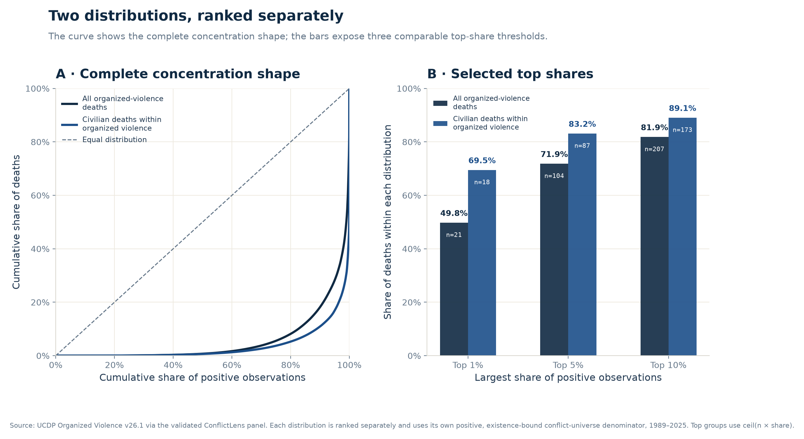
This ordering is not uniform in every subperiod. In 2000–2009 the civilian top-10% share is 63.3%, slightly below the 64.4% total-death share; in 2020–2025 it is 82.0%, against 85.9% for total deaths. So the comparison holds for the pooled period, not period by period. It remains a comparison of two shapes, not a ranking of atrocities: the samples differ in size, each curve uses its own denominator, and a large civilian-death contribution locates a number in the arithmetic — it names neither a perpetrator nor a victim.
No single statistic carries the distribution
None of this is a case against the mean. The mean answers a real question, and for totals it can be indispensable. The mistake is asking it to describe the middle of a distribution that has almost no ordinary middle to point to.
A single statistic is a single photograph of something still moving. Read alone, the mean overstates the typical case; read alone, the median hides how much of the whole lives in the tail. The honest response is not to choose between them but to show them together, and to let the distribution say which question is actually being asked.
For a strongly right-skewed distribution with a long, highly concentrated upper tail, no single summary does that job alone. Each answers a different descriptive question, and each leaves a different one open.
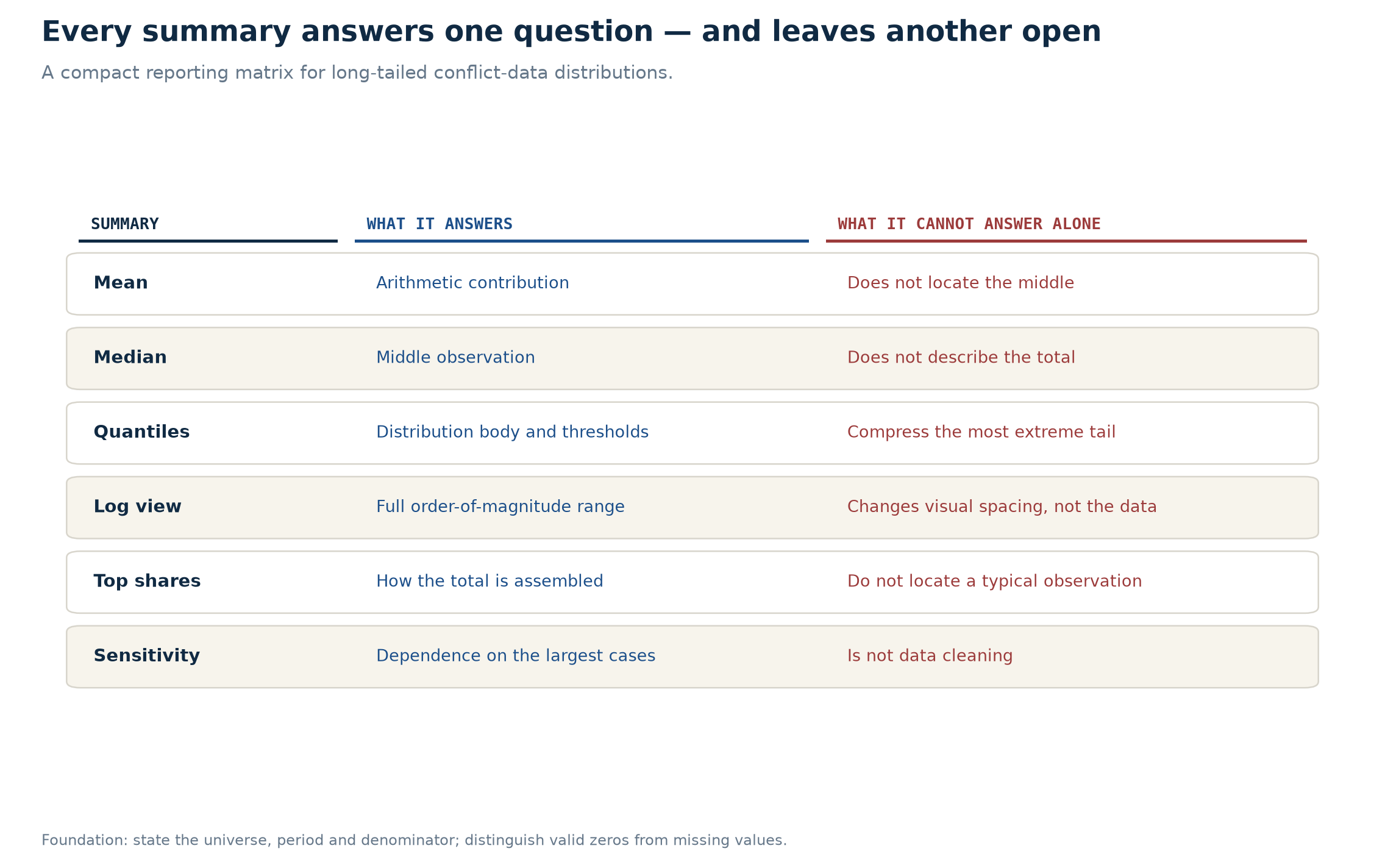
The universe and the treatment of zeros do more work than they look. This article draws its main distributions from positive country-years. A missing value is never quietly turned into a zero, and a zero is admitted only inside the validated rules on source, time and unit existence. Change that universe and you change the question — sometimes before a single statistic has been computed. Good conflict-data reporting does not require abandoning the mean. It requires refusing to let one statistic stand in for the whole distribution.
Sources
- UCDP (Uppsala Conflict Data Program, Uppsala University) — https://uu.se/en/department/peace-and-conflict-research/research/ucdp. The headline figures come from the best-estimate total and civilian-fatality variables in UCDP Organized Violence v26.1, mapped to the
analysis_unit_id + yeargrain through the validated ConflictLens panel. - The distribution, concentration, sensitivity and civilian-comparison numbers are computed from UCDP Organized Violence only. ACLED (Armed Conflict Location & Event Data Project — https://acleddata.com), V-Dem (Varieties of Democracy — https://v-dem.net) and the World Bank's World Development Indicators (https://databank.worldbank.org/source/world-development-indicators) are part of ConflictLens' wider country-year panel and do not enter this article's headline calculations.
- This article begins in 1989, where UCDP's global event-level coverage starts. It makes no claim about mass-fatality violence before that window.
Analysis notebooks
Notebooks
Country-year analysis — builds and validates the country-year analytical framework, documents the attribution and concentration metrics, and provides the core results reused by the article notebooks.
Reproduction notebook — Anatomy of concentration — recomputes every number and annotation used above, exports the seven figures, and asserts the validated results.